Aixam Mega Logo PNG
Aixam Mega is a leading automobile manufacturer specializing in the production of microcars and electric vehicles. The company is owned by the Aixam Group, a French conglomerate known for its expertise in the automotive industry. Aixam Mega’s headquarters are located in Aix-les-Bains, France, where the company operates its state-of-the-art manufacturing facilities. With a strong focus on sustainable mobility solutions, Aixam Mega is committed to delivering innovative and environmentally-friendly vehicles to meet the evolving needs of urban transportation.
Meaning and history
Aixam Mega is a renowned French automobile manufacturer that was founded in 1983 by Jacques Gandon and Lionel Gottret. The company specializes in producing compact cars and utility vehicles, with a focus on electric and diesel-powered models. Aixam Mega has gained recognition for its innovative designs and commitment to sustainable mobility.
Over the years, Aixam Mega has achieved several notable milestones. In 1997, they introduced the first electric quadricycle, the Aixam Mega eCity, which contributed to the company’s reputation as a leader in electric vehicle technology. In 2001, Aixam Mega launched the Mega Multitruck, a versatile utility vehicle with a range of applications, including transportation and municipal services.
Currently, Aixam Mega continues to thrive in the automotive industry. The company has expanded its product lineup to include various electric and diesel-powered models, catering to different customer needs. With a focus on eco-friendly solutions and urban mobility, Aixam Mega remains at the forefront of the market, providing efficient and sustainable transportation options for consumers.
What is Aixam Mega?Aixam Mega is a French automobile manufacturer specializing in the production of compact cars and utility vehicles. They are known for their innovative designs and expertise in manufacturing electric and hybrid vehicles. Aixam Mega’s vehicles are popular for their compact size, eco-friendliness, and urban mobility solutions.
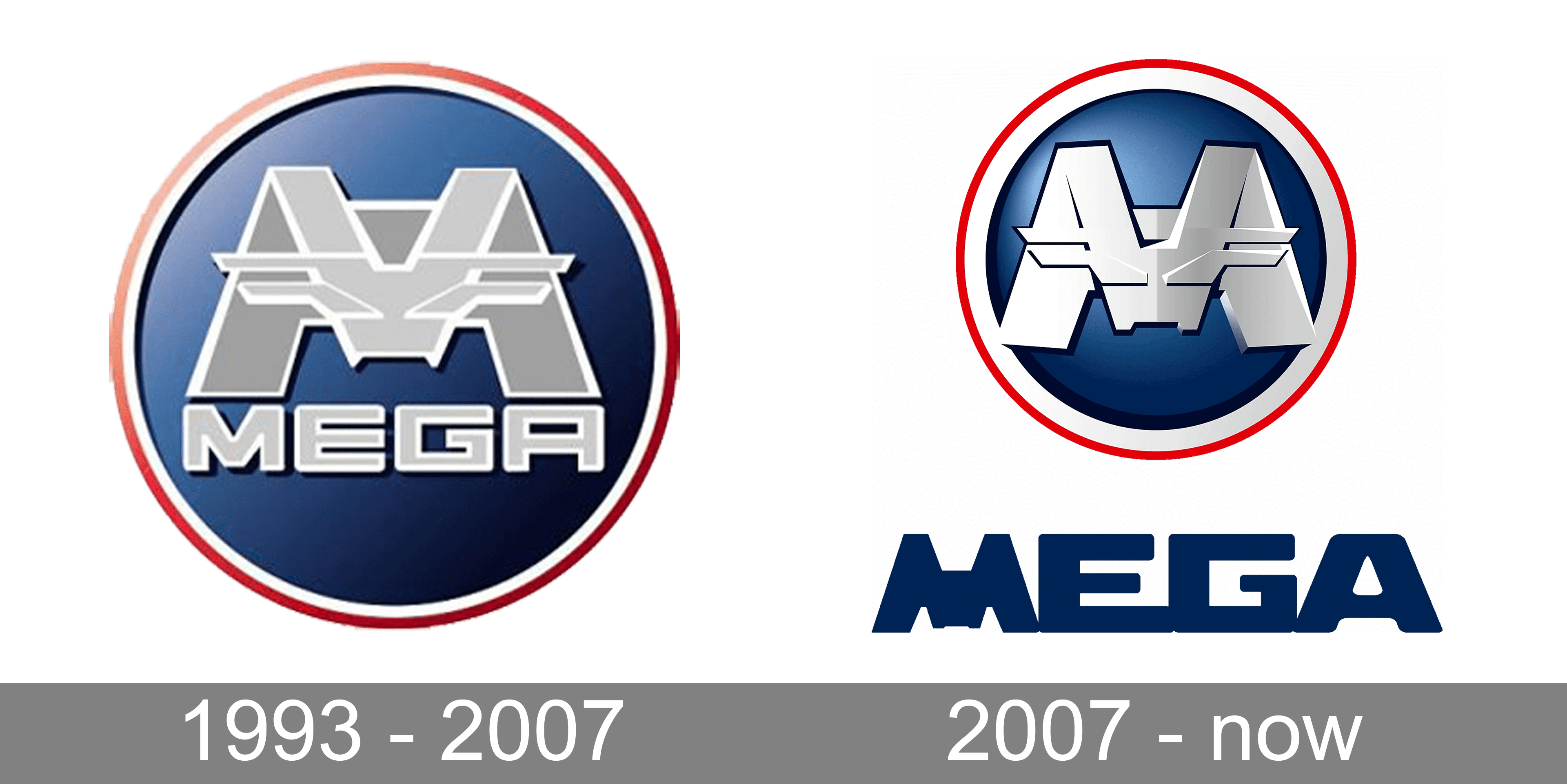
1993 – 2007

Despite being created at the end of the last century, this emblem has something futuristic and powerful about it. It is done as a dark blue round emblem that had shading to add interest and volume. A large “M” initial with “Mega” printed underneath using a bold, geometric font of a gray color with a white outline. The white and red border is a powerful detail that strengthens the solid position of the brand.
2007 – Today
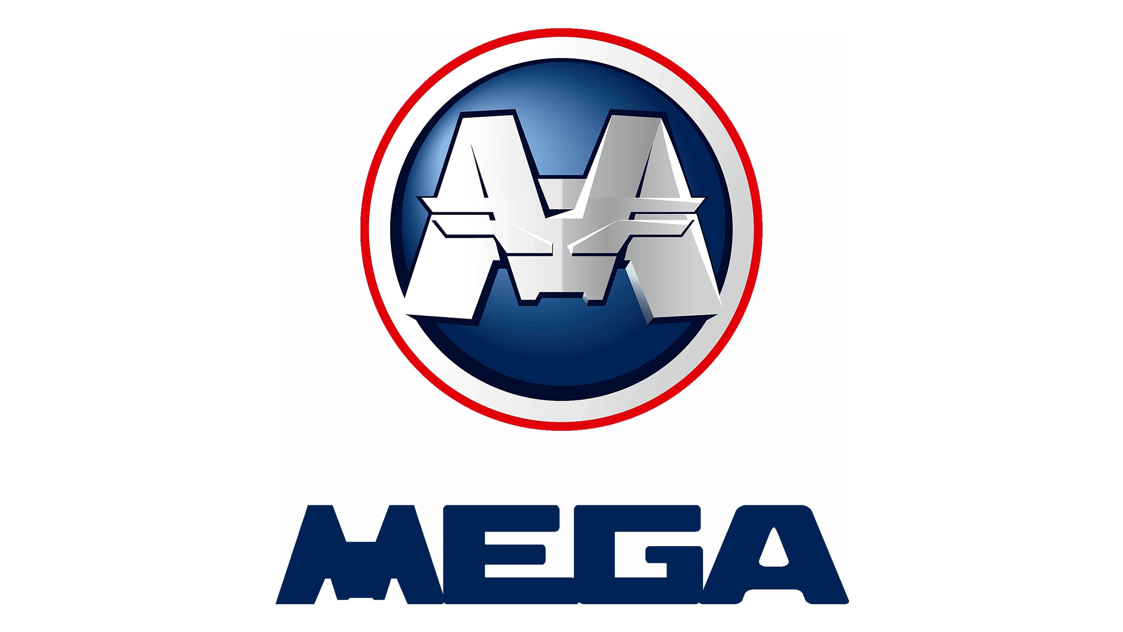
The logo was redesigned in 2007. It preserved the previous concept, but the designers took the “Mega” part outside the round emblem. It was done in dark blue using almost the same font as in the previous version. The exception was the first letter that looked like a solid “M” initial. In addition, the letters were spaced very closely, so they touched at the very bottom. The initial on the round emblem was enlarged so the ends were slightly going behind the blue base. It had a polished, striking appearance. The logo was a perfect reflection of a company that strived to be at the forefront of modern innovations and trends.

