Paypal Logo PNG
全球领先的数字支付公司贝宝(PayPal)的标志因略显过时而不止一次受到批评。然而,对于一家从事在线转账业务的公司来说,避免过于频繁地改变其形象是很自然的,因为这显然会增加诈骗的可能性。贝宝的最新标志更新使其在视觉上更具吸引力。
含义和历史
贝宝(PayPal)成立于 1998 年末,最初名为康菲尼迪(Confinity)。起初它专注于安全软件。然而,在 2000 年与在线银行公司 X.com 合并后,其主要业务转向了转账业务。就在那时,该公司以现在的名字广为人知,并获得了它的第一个标志,那只是一个带有蓝色边框的白色文字标志。
什么是贝宝?
贝宝是世界上最古老、最受欢迎的在线支付系统之一的名称,它创建于 1998 年,在最初的几个月里被命名为康菲尼迪。该公司最初的专业领域是计算机安全,因此贝宝的用户可以充满信心并感到受到保护。
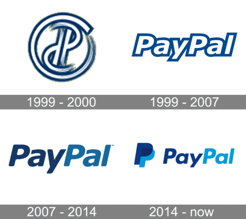
1999 – 2000

The earlier logotype was a small round icon that included two letters ‘P’. They were placed back-to-back with one letter upside-down, and the designers also added a hazed effect to parts of this logo to make it appear mid-motion. To this end, they’ve also tilted the letters.The emblem is mostly white with dark blue borders around all elements.
1999 – 2007

The very first logo for PayPal was introduced in 1999 and stayed with the famous online wallet for eight years. It was a white inscription where each of the letters featured a thick blue outline. The lettering was executed in a modern sans-serif typeface with distinct contours and sharp angles. The italicized letters were glued to each other.
2007 – 2014

2007 年,PayPal 的标志发生了重大变化。公司不再使用白色的文字标志,而是采用了一个带有两种蓝色色调的标志。此外,字体变得更加简洁,字母之间的间距也变大了。在易读性方面,这显然是一个改进。然而,一些设计师指出,旧的文字标志在各种背景颜色上效果更好,而新标志在某些背景(例如蓝色)上无法提供良好的对比度。
2012 年,文字标志进行了小幅调整,字体变得稍微圆润了一些。
2014 – Today
Probably, the most successful PayPal logo so far has been the one introduced in 2014. The campaign was designed by San Francisco, CA-based design firm and included not only a new wordmark, but also an icon and a new PayPal interface. It was an absolutely logical move, taking into consideration the rise of mobile technologies.


Font
The clean, round sans-serif type of the 2014 PayPal logo may seem very similar to the one used in the previous emblem. However, there are a couple of differences. The most noticeable one is the new “a” character. Also, the letters seem to have grown a bit wider, which is especially visible when you look at the “y” character.
Color
PayPal 在企业色彩方面始终秉持蓝色基调,不过其色调历经调整。当前版本采用了更为明亮的色调,该公司在与其他支付网关的竞争中似乎更具优势。
试问谁设计了 PayPal 的标志?PayPal 的标志由 Fuseproject 设计局精心设计而成。设计师团队由伊夫·贝哈尔领衔,他助力团队成功打造出带有字母组合的标志性标识,如今此标志与安全的在线支付及即时转账紧密关联。
PayPal 的标志呈现何种颜色?PayPal 的视觉标识调色板以两种蓝色调为基础,科技品牌以及与金融相关的企业常常选用这种颜色,原因在于其象征着安全与忠诚。PayPal 的徽章运用浅蓝色的潘通 2935 C,以及相对较深的色调,即潘通 648 C。

